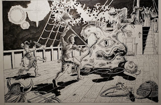
This is the piece from Tales From The Smoking Wyrm #2 that, despite the detail, took little time for me to illustrate. Looking back on it critically, yeah, I could've done better, but it came out good considering the deadline crunch I was under. Ironically, COVID-19 would delay getting issue 2 printed so we could've spent more time on it in hindsight, but it is what it is. I made the deadline and Trevor was more than happy with the results.
 |
| Finished illustration. |
Trevor's original brief was simple: draw a Cthulu cathedral. He sent me a few photos for reference. I immediately settled on the perspective that I wanted and borrowed elements, albeit simplified, from his reference photos for the initial sketch.
 |
| Concept sketch. |
I know I wanted a messianic-like figure to lead the congregation, and I knew this figure would be mostly obscured in shadow. Originally I thought about making the alter itself to be some sort of fleshy mutation thing, but with the way the light sources were going to work in this I realized it was going to make that area of the piece way busier than I needed it to be. So I saved that alter for maybe something in the future...
 |
| Priest and alter. |
After I was pleased with the concept I sent it over andTrevor loved it. That sketch was the basis for the main drawing. I ruled out the perspective on the bristol board and began filling in details.
 |
| Pencils. |
I was worried that I would botch this at some stage so I took scans at various steps along the way as a back up plan.
I had a lot of ruler work on this one as it's a complex perspective drawing that required a strict attention to those details.
The stain glass window was a simple drawing. I had intended to do more with them but I decided they might get lost in the details so I kept them as simple line art. I think that turned out to be a good decision in the end.
The shadows on the bricks on the background were crucial in making the key points of the drawing 'pop out'. I wanted that contrast to add an element of three-dimensionality to the piece as we well as to make the arching energy seem as bright and illuminating as I could without washing out the other details.
When this was published it was reversed, even though I intended this piece to "read" from right to left it still worked. Some of the text copy covered up a lot of the columns (which was intended by design) but I still get a kick out of including details that the casual reader of Tales Of The Smoking Wyrm might never catch. In this case, if you look at the columns there are eyes on each one that are waking up as the energy crackles by. This was Trevor's idea and I thought it was a creepy and subtle effect to illustrate.
All-in-all, this is one I like a lot and maybe it would be fun to revisit this idea as an acrylic painting at some point.


